
Enhancing Digital Content Visibility with Color Contrast
It is important to create digital materials that are accessible to all students, including those with visual impairments that affect their ability to perceive specific colors. To ensure this, you can use a helpful tool called the Colour Contrast Analyser (CCA) to ensure the materials are clear and easy to read.
Using the Colour Contrast Analyser (CCA)
The Colour Contrast Analyser checks if there is enough difference (contrast) between the text color and background color, ensuring it meets accessibility standards. For example, ensure the text is dark enough against a light background (or light enough against a dark background). This helps students with visual impairments or color blindness read content without problems.
Not compliant
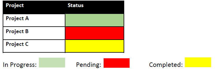
Table with no color (color blind)

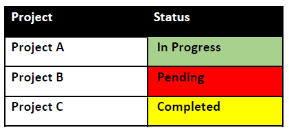
Compliant
Additional Resources
Visit Charts & Accessibility by Penn State.
Learn more about color contrast from the Universal Design Center.