Can You Read This? Using Color Contrast in Universal Design

Color can be a potent way to grab attention and convey information – and a few simple techniques can make it even more effective for the widest possible audience.
- Make sure text is dark enough against a light background (or light enough against a dark background). You can eyeball this up to a point, but the Color Contrast Checker is our favorite tool to verify.
- Don’t forget to check words in images too.
- Using a video? While reviewing the closed captions, also make sure they appear clearly against the video background.
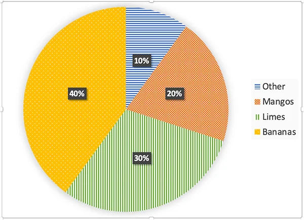
- If the color you use has meaning, add that information in a second way. For example, if an assignment references colored items, number or label them as well.
Learn more about color contrast from the Universal Design Center.